
Pardeep Dhaliwal
Business Cards
https://www.copypoint.ca/images/business_cards2.jpg
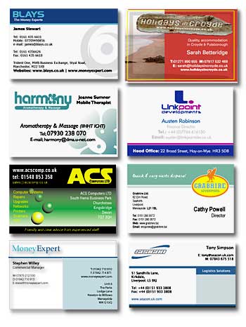
1.This one is good because the title catches your eyes and then your eyes go to his name and then his contact information. The picture is also nice because they watermarked it and stretched it instead of having a smaller picture. The information is organized neatly and it looks professional.
2. The second example has a nice logo (Harmony). The contact information is big and in the middle. The image looks nice and they didn’t overdue it with too many colors.
3. This example has lots of different colors; the logo is nice and catches your eyes. The only problem is the yellow writing is hard to see. The top and bottom are contrasting with the middle. They also repeat the same font color and style.
4. This one is nice because they use left and right alignment. It is a little plain.
5. This one is really creative and has a nice picture and title. The border makes the image stick out and adds another dimension.
6. The problem with this one is that everything is centered. The bottom looks nice because it is a different color and contrasts with everything else.
7. In this one the logo is in a good spot between the title and the middle. It's different and catches your eye because the logo is usually in a corner. Everything is left aligned and the contact information is easy to see because of the bolded font.
8. This last example looks clean and professional. Nothing catches your eyes too much but the logo stands out because of its font. The blue line underneath the title and at the bottom of the card is the same. They used both left and right alignment to make it easier to read.
https://luxa.org/images/tutorial6/top.jpg
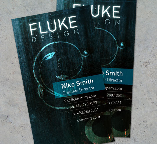
This card is very visually appealing. The design is nice and you want to read it. The text is right alligned which looks better because its rarely used properly.
https://www.bestbusinesscard.net/wp-content/uploads/2011/07/vertical-business-cards-2.png
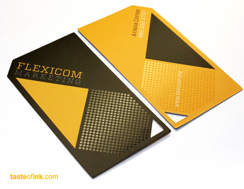
This card is good because it catches your eyes. The title is in a strange place but its better than it being centered like every other business card out there. It's double sided but is missing information like e-mail and alternate phone numbers. They repeated where his name is on the back. The side of the triangle is alligned with the circles.
https://www.businesscards2k.com/cards/blue_rose_vertical_business_cards-p240632084985740377zw5c2_300.jpg
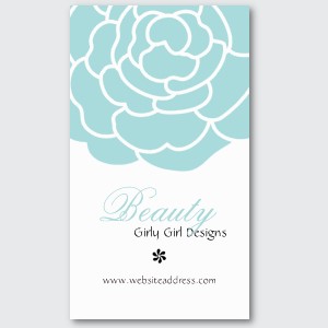
This card has a nice big graphic. They used the same colour as the picture in the font that says "beauty" which ties the two things. Its lacking contac information though.
https://media02.hongkiat.com/creative_business_cards/Business-Card-Template.jpg
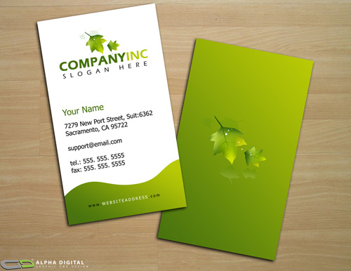
This card is looks like it was done by a professional, it looks clean but its not boring. The back of the card uses the same colour as the front. The logo is nice and the text underneath is eye catching because of the two different greens.
https://picketreport.files.wordpress.com/2011/02/vertical-business-card.jpg?w=404&h=316
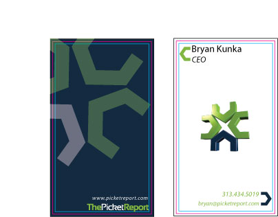
This card uses contrast from the front being white and the back being a dark blue. The information at the bottom is eye catchin on both sides because the text colour and style are different than the other text. The border coulours are swapped on the other side. The big image on the back looks like its pushing the text into the corner which adds contrast.
Looked at Armun's cards- armun-portfolio.webnode.com
Parm's- parm-portfolio.webnode.com
 After
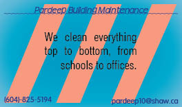
AfterTopic: Business Card 1
Date: 07/11/2011
Subject: looking over
—————
Date: 07/11/2011
Subject: Looking Over
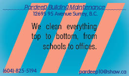
Topic: Business Card 2
Date: 07/11/2011
Subject: looking over
—————
Date: 07/11/2011
Subject: looking over

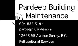
Topic: Business Card 3
Date: 07/11/2011
Subject: looking over
—————
Date: 07/11/2011