
Pardeep Dhaliwal
Note pg 31-48 (Ch.3)
Alignment Slug- Where you put author information, information about type of paper, special oreder links, and other instructions for printnig process.
- Nothing should be placed on the page arbitarily. Every item should have a visual connection with somthing else on the page.
- Don't just throw informarmation around.
- When items are aligned, it creates a strong cohesive unit.
- Even is the aligned items are seperated, an invisible line connects them.
- You dont need to use a center alignment.
Unity is very important in concept design. There has to be a visual connection between elements.
Avoid using more than 1 text allignment; don't allign to the left and then to the right.
Pg 44-45
- The big M is alligned with the "u" from the bottom.
- The bottom of the isignia is lined up with the second last line.
- The big W is sticking out instead of being alligned with the paragraph.
- The line under the picture is the same width as the columns.
- The authors name at the top is seperated from the other writing, the name is flushed right and the writing is to the left.
- The title is alligned with the top and bottom of the picture.
- The paragraphs that are too small are combined with the paragraph underneath it.
- The picture with M is alligned with the paragraph instead of in a random spot.
-
The authors name at the bottom is in the proper place, at the end of the story.
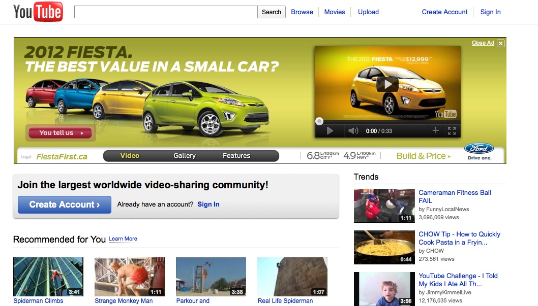
Everything on this page is aligned, the logo at the top is aligned with everything on the side. The part underneath the car ad is aligned with the word "Trends." They contrasted the color of the links with the color of the headings.