Pardeep Dhaliwal
Website analysis- Good Website

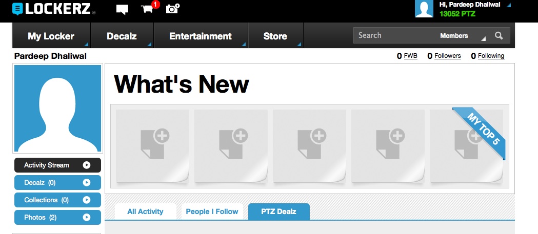
This website has a modern look. The colors look nice together. Everything is easy to find from the tabs but there is also a search bar. On this website you earn points and redeem them for electronics and other things. The target audience can be anyone between 13-30. The header tells you how many points you have which is all you need to know. The website loads fast and there doesnt seem to be any problems. Everything is readable and well organized. There are no distracting ads or spelling errors. The website is very popular so it's easy to find on google. The links on the website tell you what page your on, ex- vidoes.html. There are no plug-ins required. There's no site map and the only thing that can be personalized is your profile picture. You stay logged in until you logout which is good but can also be bad if you log on in a library or other public place. The website color and design scheme stays the same throughout it's other pages. The level of interactivity is good because you can watch vidoes and listen to music as well as earn points and buy things. Also, there are questions you can answer to earn points. On the home page it tells you all the major updates under the "What's New" section. The website draws people back because you get points for logging in daily and new vidoes and offers are always being added. The tabs tell you what sections there are when you put your mouse over them. To go back to the home page all you have to do is click the lockerz logo at the top left corner, or go to my locker-home. The last little convenience on this website is the tab that says support, you can talk with someone or e-mail them about any technical issues.
Good Website #2

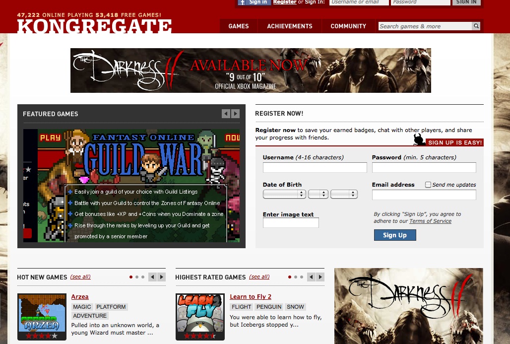
- This website has many different features
- The main purpose of going on this website is to play games
- The website draws people back because you can create an account and earn badges for the games you play
- Other features include,
- Chat
- Raffles
- The overall look of the website is very nice
- It has good contrast
- Everything is easy to read and find
- There is a category section so everything is organized
- There is a search and different game categories
- The website also teaches you how to make games
- People who create good games and put them on kongregate can win upto $1500
- You can rate, comment games and favourite them, once you do that the website suggests games you might like
- There is a mouse over function on the tabs
- There aren't any technical issues but if you are missing an achievement or are having other issues there is a good help section
- The header is nice and doesn't change throughout the different pages
Bad Website

This website is bad because:
- It has 1 very long running home page.
- There are many different links all over the page going to random places.
- At the bottom of the page there are many boxes that open up as a download, but you have no idea what it is.
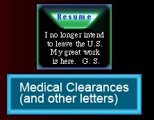
- The green bottons at the top that go to different parts of the website are very small and hard to read. Also they don't look like links.
- All of the links to the subpages link to the same page even though they are seperate.
- Where it says "Ex-FBI Agent's Gruesome Ordeal," there is a line running through the top.
- The background has two different colors while all the writing and links are also diferent colors.
- All the content is very confusing because of the colors and where they are.
- There are many different ads all over the page which draw attention away from the purpose of the page.
- The link that says alternate translation takes a long time to load and only translates some parts of the website.
-
When you translate, some of the images start to overlap eachother.

- After the website's been translated, the only way to go back to english is to hit the back botton.
- Overall the website looks like it was designed by a kid.
- There are no helpful tabs.
- The website does not draw people back and there is no purpose.
- There is a very long site map but it's hard to tell where the links will go.
- There's not much interactivity and there is way too much text.
- The links to the other pages are strange looking because they are multi-colored boxes and it's hard to tell if they are images or links.
